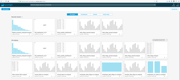
Create the Amazon QuickSight Visualizations
Create the Amazon QuickSight Visualizations
In this section our goal is to create a visualization that will assist us to investigate the amount of time a flight gets delayed and related attributes.
- Navigate to the Amazon QuickSight console.
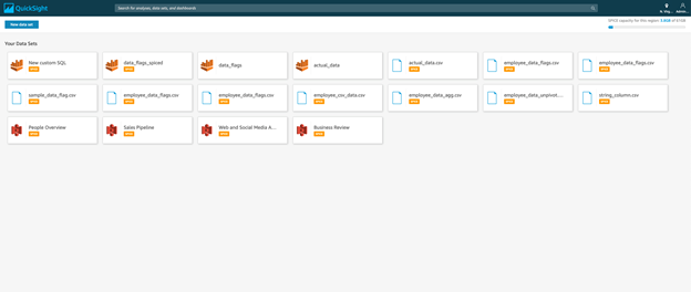
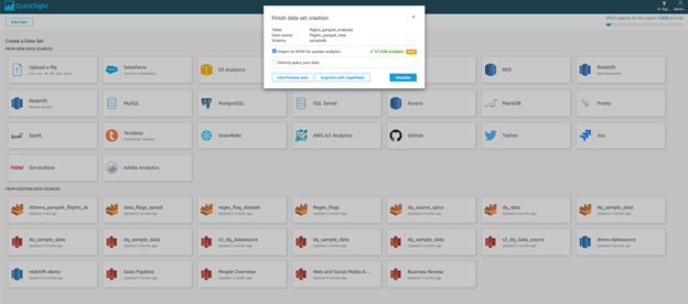
- Click Manage data, it should show the below screen.
- Click new dataset
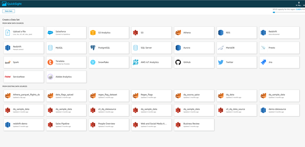
- Click Athena. For Data Source Name, enter Flights_parquet_view. Leave the workgroup as Primary and click Create Data Source.

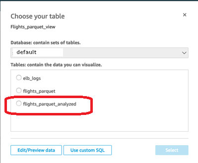
- Next, from the drop down select the default database. Once selected, you should see option to choose a table. Select flights_parquet_analyzed and click Select.

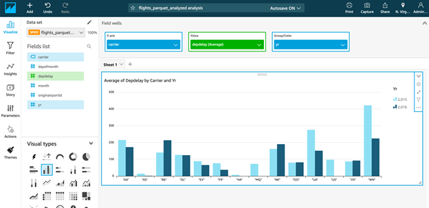
- Click Visualize to open the Visualization UI.
- Select bar chart. Drag the carrier field to the X-axis. Drag depdelay to value and select drop down for the value and change the aggregation function to Average. Also, drag yr to the Group Color section. The result should be a bar chart showing average departure delay by carrier and year.
- Now we will go ahead and add another widget to display data. Select Add Visual from the header.
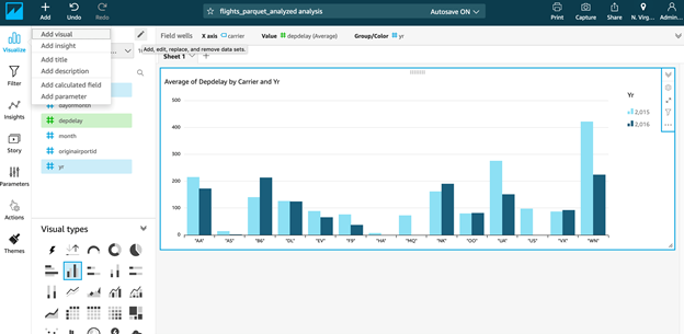
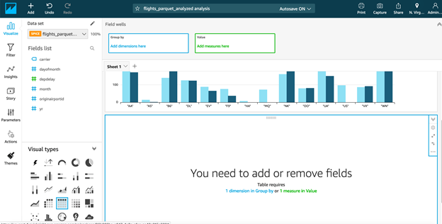
- Select Table from the visual types.
- Select carrier and yr in the group by column. Add depdelay in the value column and select average as the aggregate function.

- Then, click the first widget and on the left hand side select actions. Define a custom action: Select Filter action, and target visuals (in that selection select widget2), click save. Now when you select a bar , it should filter rows for widget containing data.
